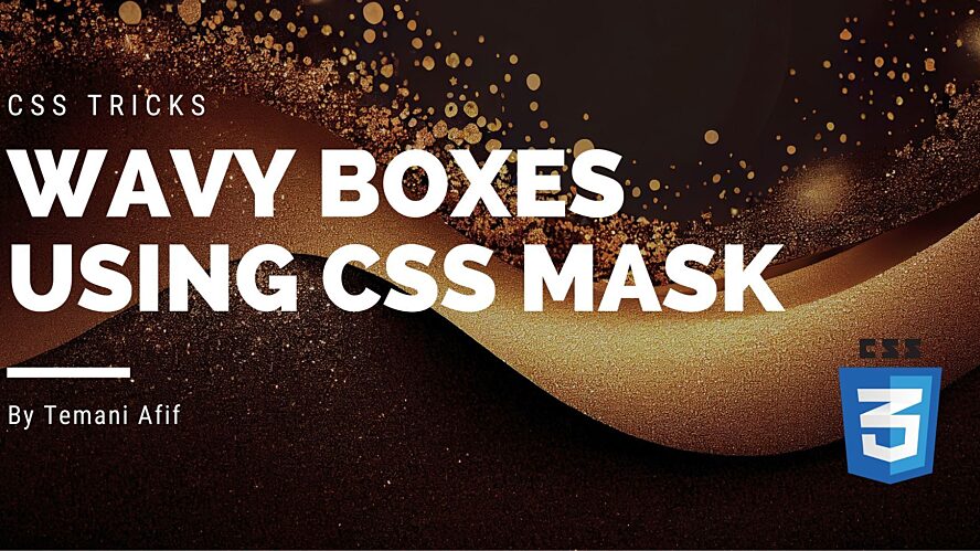
How to Create Wavy Boxes Using CSS
]]>
How to Create Wavy Boxes Using CSS
]]>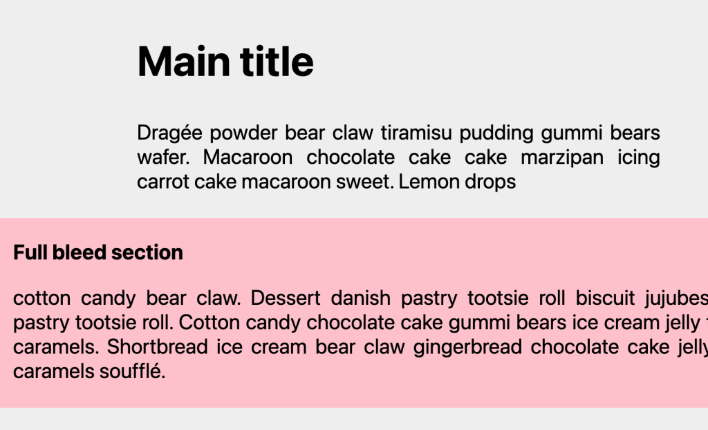
Full-Bleed Layout with Modern CSS
]]>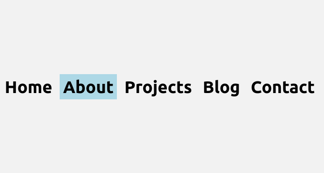
Fancy Menu Navigation Using Anchor Positioning
]]>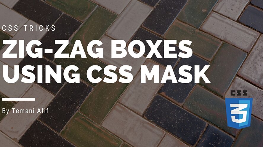
How to Create a Zig-Zag Box Using CSS
]]>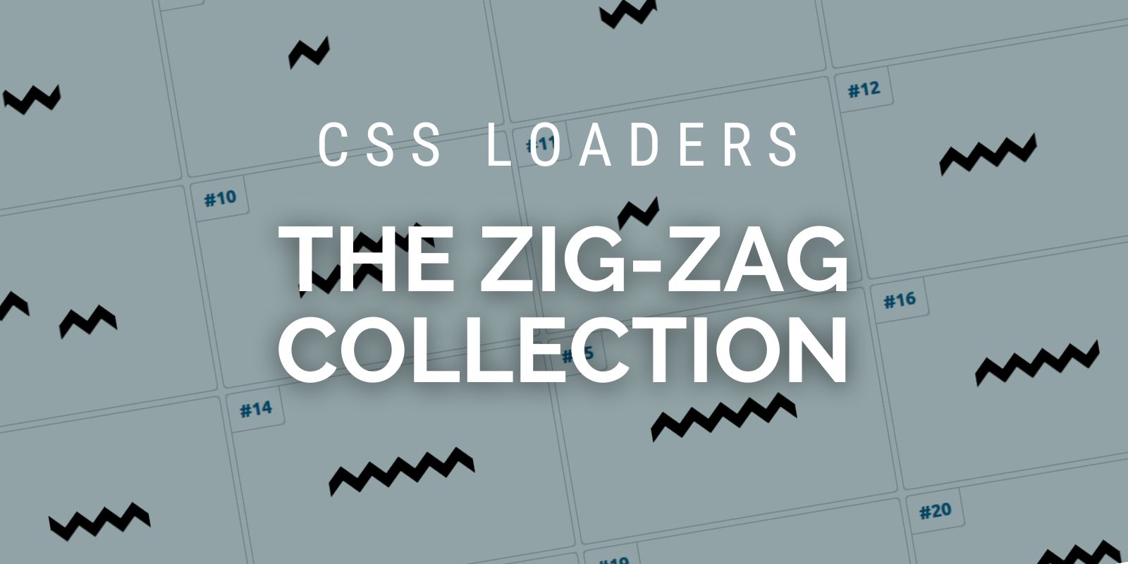
How to Create Zig-Zag CSS Loaders Using One Element
]]>
Custom Progress Element Using Anchor Positioning & Scroll-Driven Animations
]]>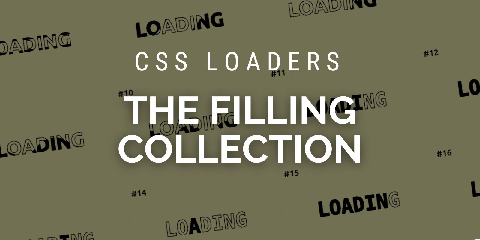
How to Create Filling CSS Loaders Using One Element
]]>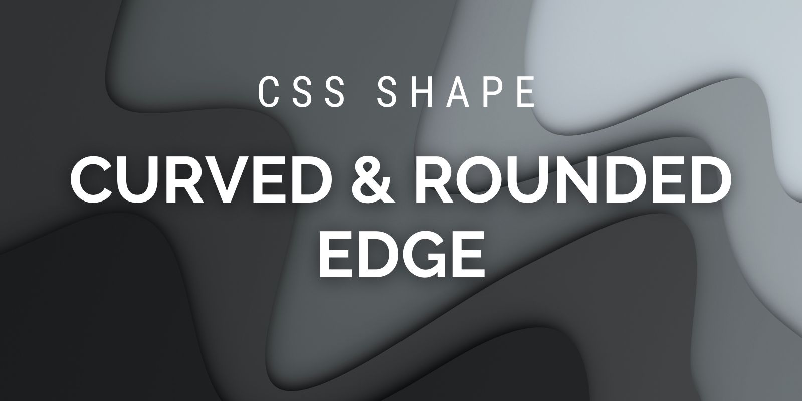
How to Create Curved-Edge and Rounded-Edge Shapes Using CSS
]]>
CSS Tricks That Use Only One Gradient
]]>
How to create Shapes with Inner Curves using CSS Mask
]]>
Custom Range Slider Using Anchor Positioning & Scroll-Driven Animations
]]>
How to Get the Width/Height of Any Element in Only CSS
]]>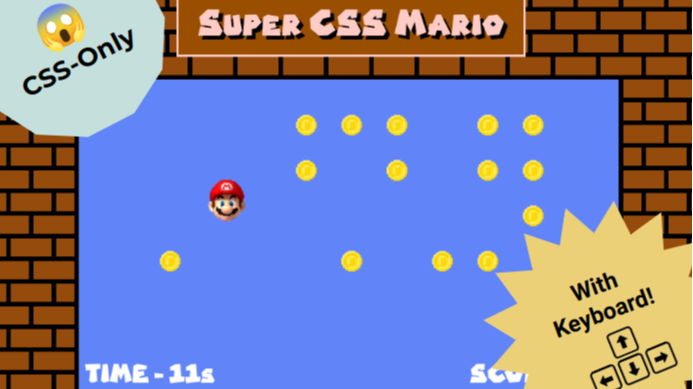
How Keyboard Navigation Works in a CSS Game
]]>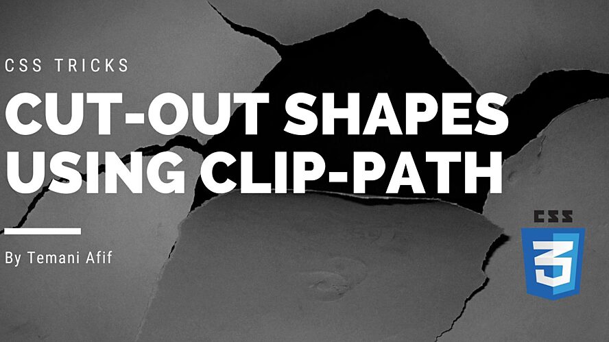
How To Create Cut-Out Shapes using The clip-path property
]]>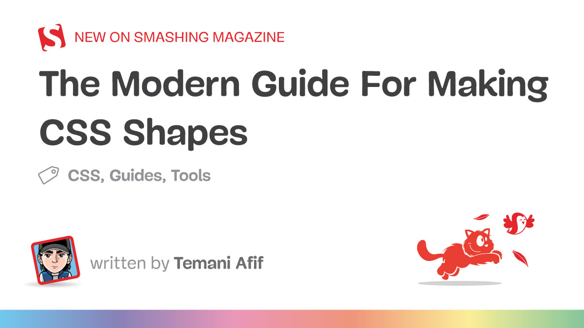
The Modern Guide For Making CSS Shapes
]]>
css-shape.com: The Ultimate Collection of CSS-only Shapes
]]>
Sliding 3D Image Frames In CSS
]]>
CSS Tricks To Master The clip-path Property
]]>
Creating Wavy Circles with Fancy Animations in CSS
]]>
Modern CSS Tooltips And Speech Bubbles (Part 2)
]]>
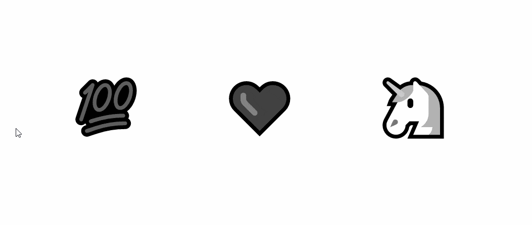
Do you need a Tooltip or a Speech Bubble? I have created 100 using CSS 😲
]]>
Modern CSS Tooltips And Speech Bubbles (Part 1)
]]>
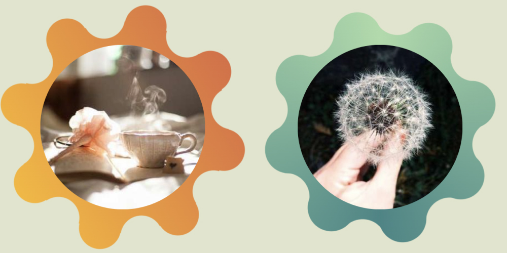
Creating Flower Shapes using CSS Mask & Trigonometric Functions
]]>
CSS Shapes: The Triangle
]]>
The Complex But Awesome CSS border-image Property
]]>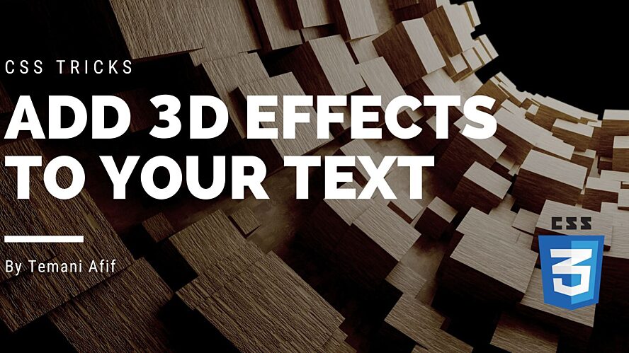
CSS Tricks to add 3D Effects to your Text
]]>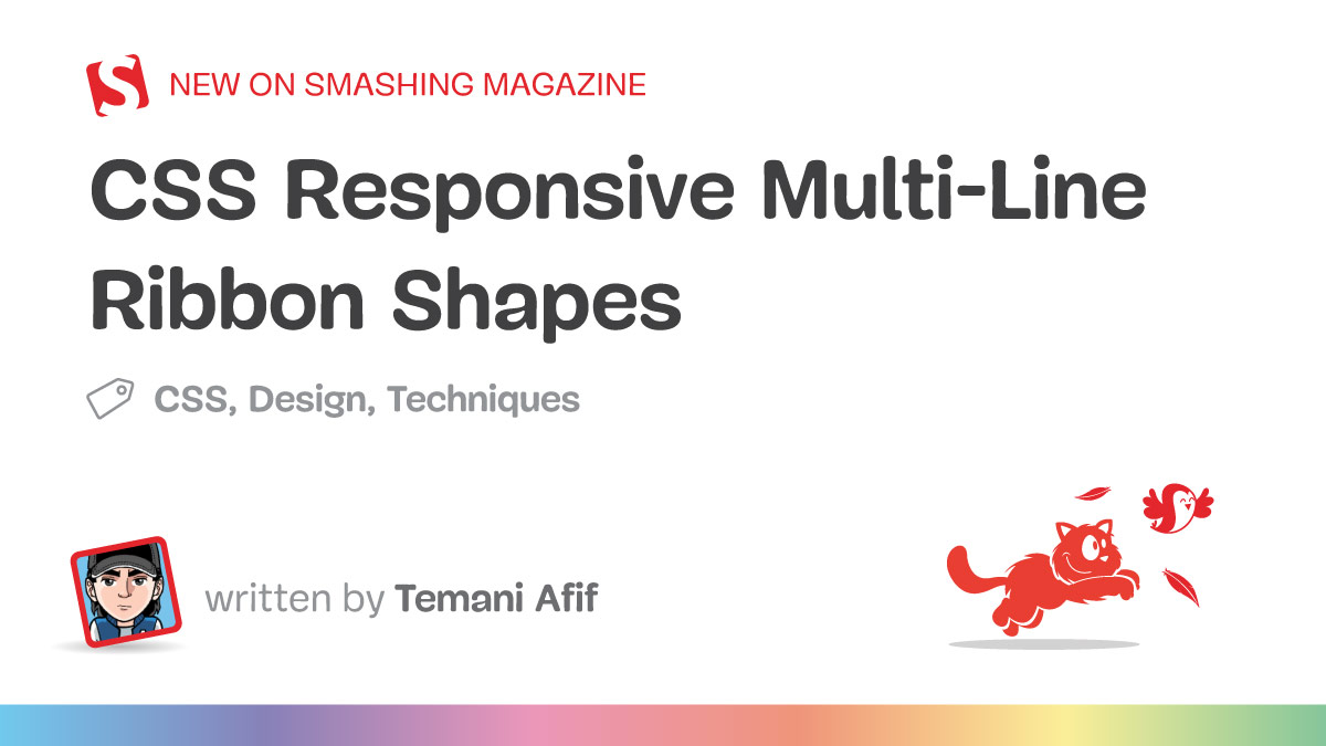
CSS Responsive Multi-Line Ribbon Shapes (Part 2)
]]>
CSS Responsive Multi-Line Ribbon Shapes (Part 1)
]]>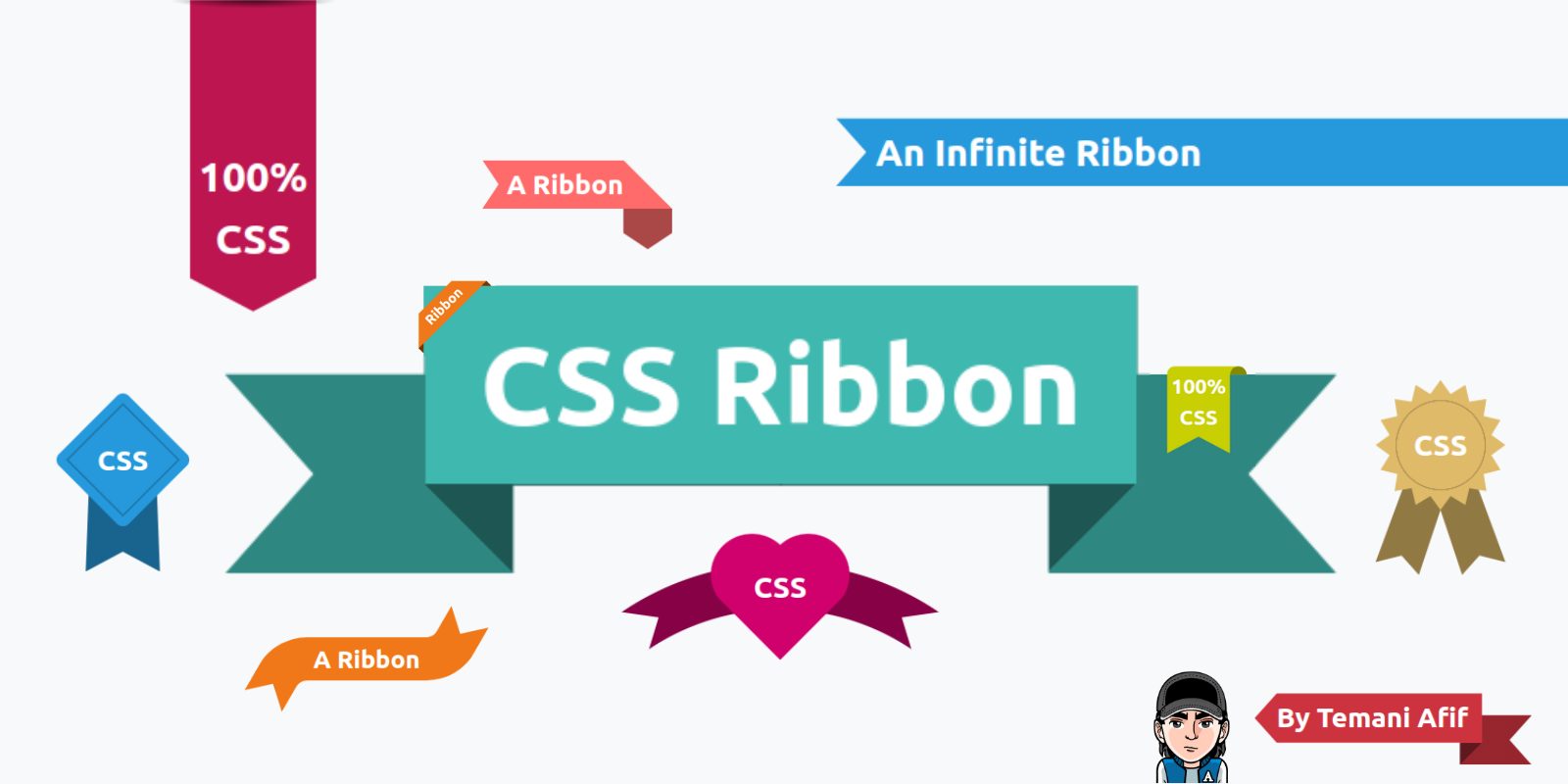
I have made 100+ CSS-only Ribbon Shapes | The Perfect Collection 🎀
]]>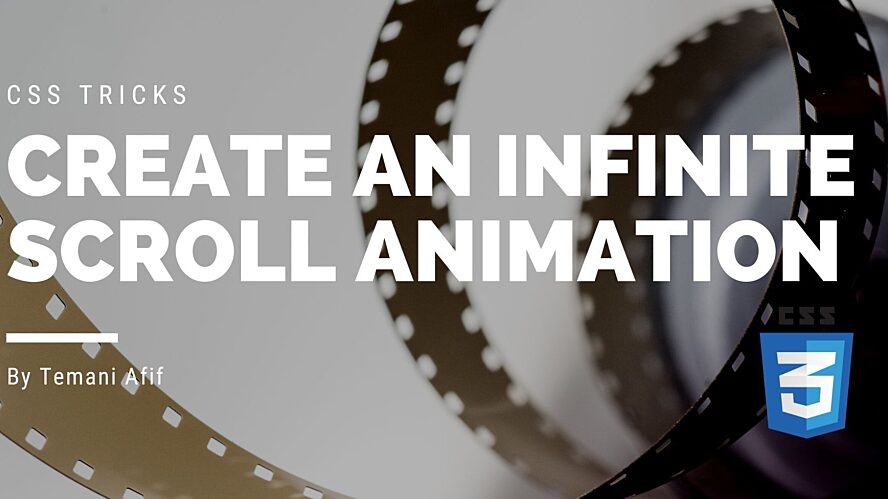
How to create a CSS-only infinite scroll animation
]]>
Re-Creating The Pop-Out Hover Effect With Modern CSS (Part 2)
]]>
Re-Creating The Pop-Out Hover Effect With Modern CSS (Part 1)
]]>
How to Create CSS Ribbon Shapes with a Single Element
]]>
CSS Shapes: The Ribbon
]]>
Revealing Images With CSS Mask Animations
]]>
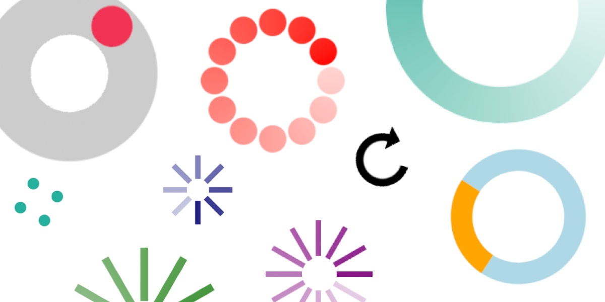
css-loaders.com: The Biggest Collection of Loading Animations (more than 500 🤯)
]]>
How To Define An Array Of Colors With CSS
]]>
CSS effects on images II
]]>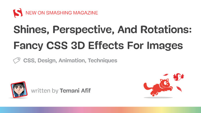
Shines, Perspective, And Rotations: Fancy CSS 3D Effects For Images
]]>
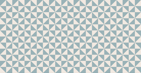
One-click and you have the best CSS Pattern that matches your preference.
]]>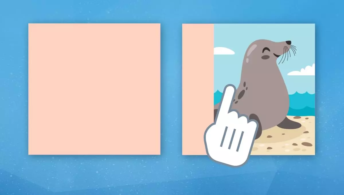
In this article, we’ll explore some CSS tricks that allow us to create a hover animation for revealing our images.
]]>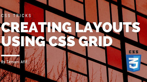
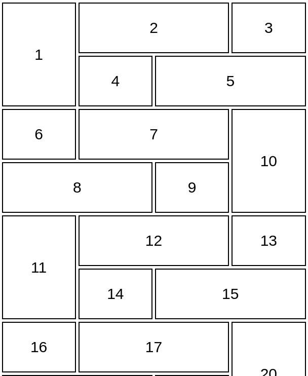
In this article, we will use CSS Grid to build some common layouts. The goal is to combine modern CSS tricks to create such layouts with the smallest code possible. In the end, you will have a collection of CSS boilerplate that you can easily reuse in your projects.
]]>
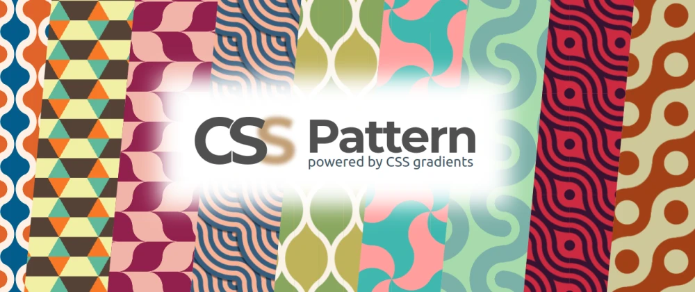
After the CSS Loaders and the CSS Underline/Overlay animations, I am back with another big collection. This time it's about CSS Patterns.
]]>
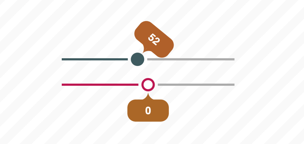
In this article, I’ll show how to use modern CSS techniques to create an eye-catching, custom range slider with nothing but the native HTML input element.
]]>
Create a heart shape using modern CSS tricks. You can even transform images into hearts
]]>
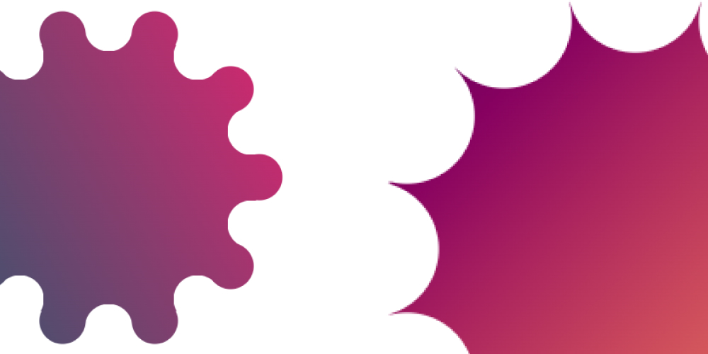
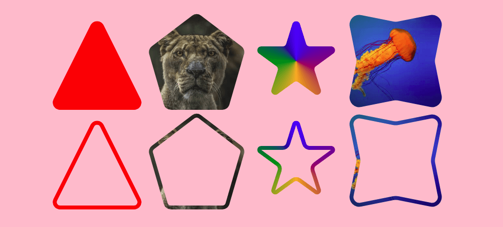
In this article, we are going to build CSS Shapes! We will use clip-path combined with some math to generate polygon and starburst shapes.
]]>
In this article, we are going to build a simple but cool reveal animation that you can apply to your text. It will also work with multi-line of texts! All you have to do is to add a class and see the magic in play.
]]> ]]>
]]>
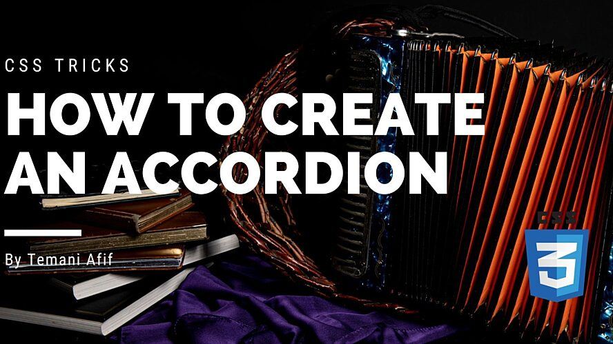
In this article, we will create an accordion using CSS. Another common component that we create using minimal code. Most of the tricks rely on input hacks but we will do something different here.
]]>
in this article, we will tackle another famous component: the breadcrumb navigation. I will try to combine modern CSS Tricks to create a breadcrumb system easy to manage and scalable.
]]>
It’s a question I hear asked quite often: Is it possible to create shadows from gradients instead of solid colors? There is no specific CSS property that does this (believe me, I’ve looked) and any blog post you find about it is basically a lot of CSS tricks to approximate a gradient. We’ll actually cover some of those as we go.
]]>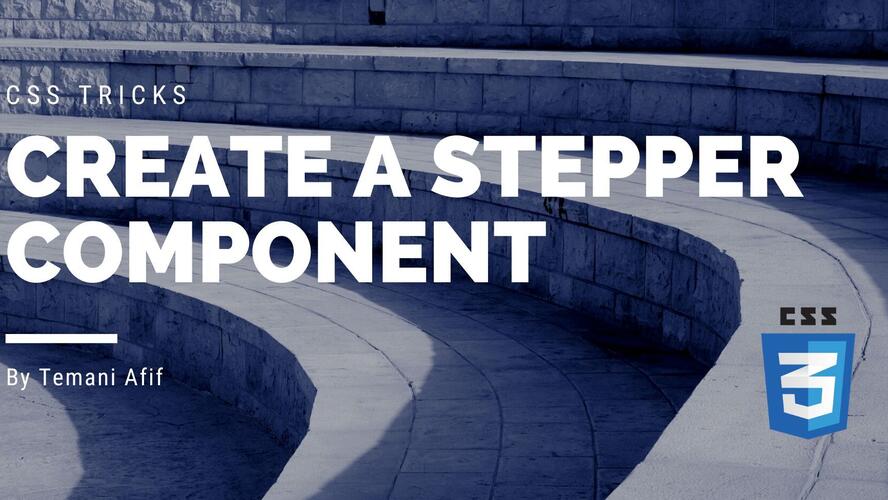
In this article, we will build a component commonly used everywhere especially when it comes to multi-step forms: The stepper component.
]]> ]]>
]]>
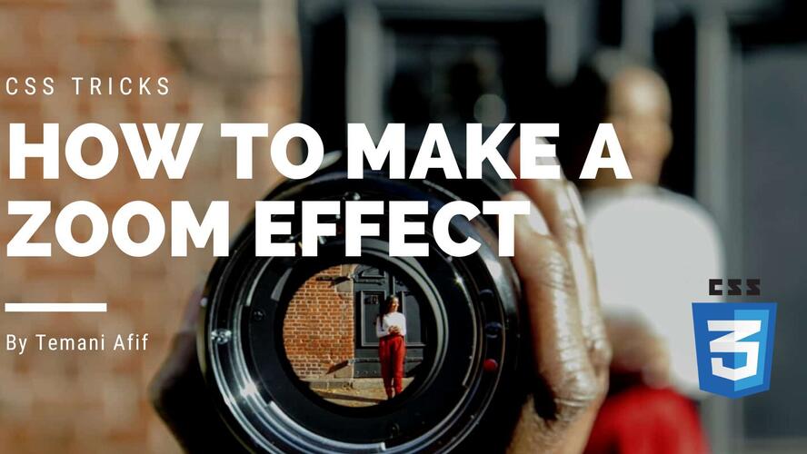
In this article, we will cover a famous effect used in e-commerce websites: Zooming over images. We will see how to achieve such an effect using CSS and with the smallest amount of code possible. We will end with an interactive demo at the end.
]]>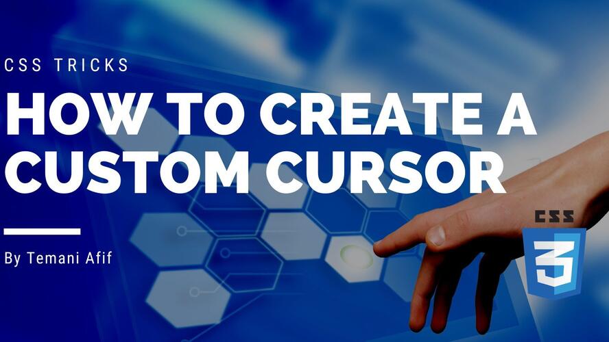
In this article, we will cover different ways of creating a custom cursor using only CSS. We will study two different methods. The classic one that you probably know and an advanced one lesser know.
]]>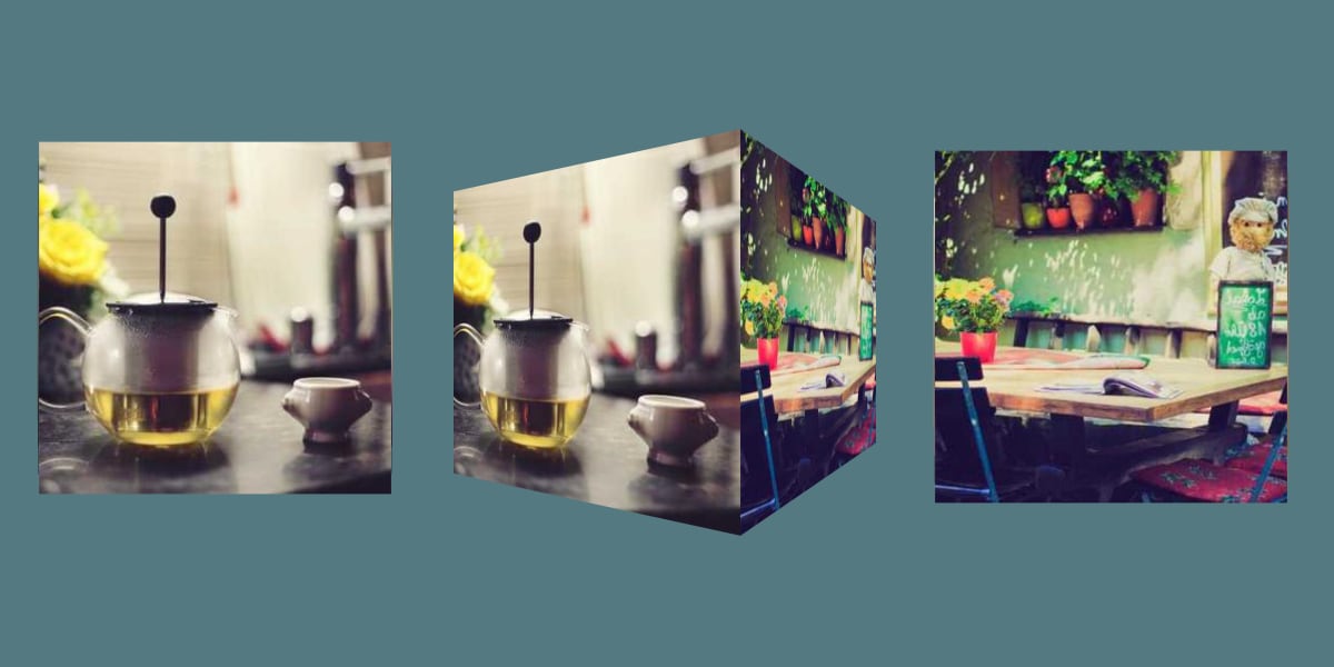
This time around, we’re diving into the third dimension. It’s going to look tough at first, but lots of the code we’re looking at is exactly what we used in the first two articles in this series, with some modifications.
]]>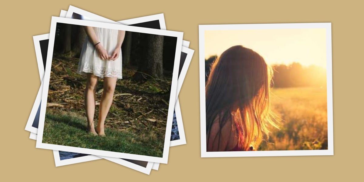
In the last article, we made a pretty cool little slider (or “carousel” if that’s what you prefer) that rotates in a circular direction. This time we are going to make one that flips through a stack of Polaroid images.
]]>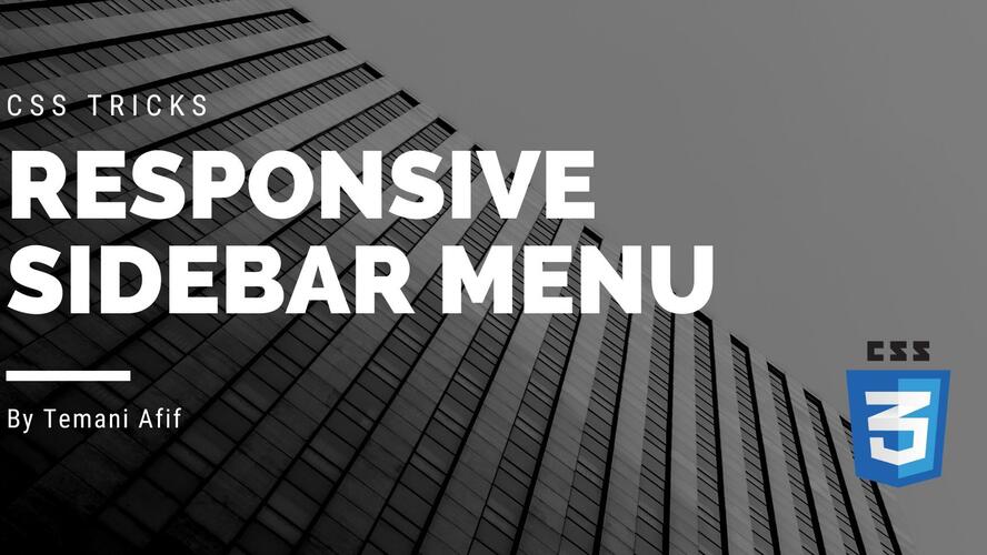
In this article, we are going to build a responsive sidebar menu. I will be reusing the same code structure as the previous article so it’s highly recommended to read it before this one to fully understand all the tricks.
]]>
Through a little series of articles, we are going to explore some fancy and uncommon CSS-only sliders. If you are of tired seeing the same ol’ classic sliders, then you are in the right place!
]]> ]]>
]]>
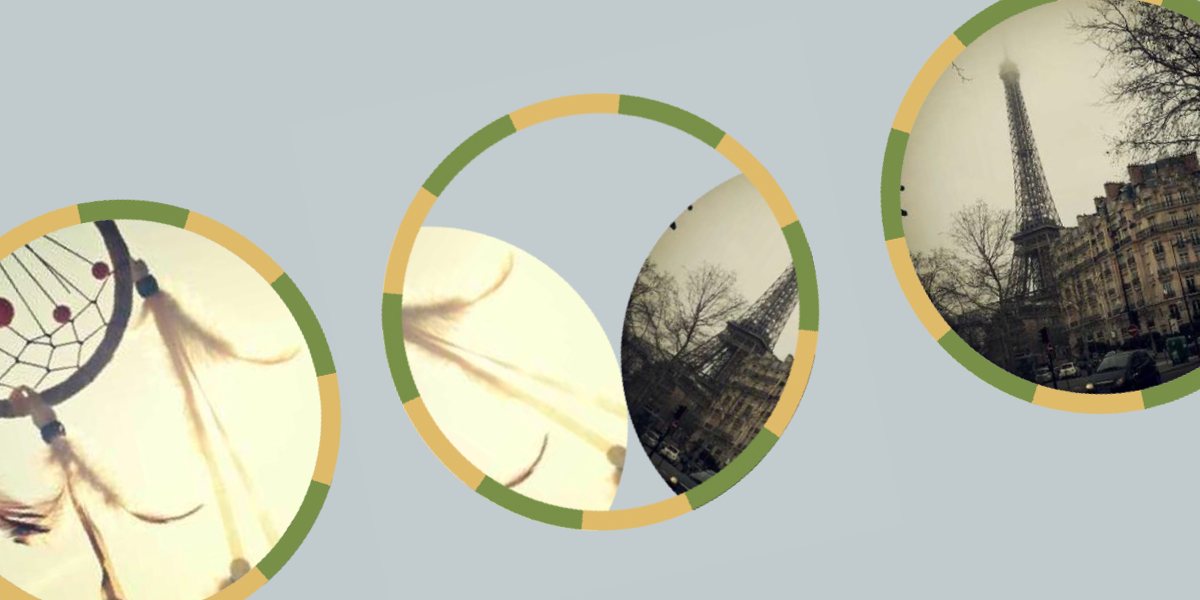
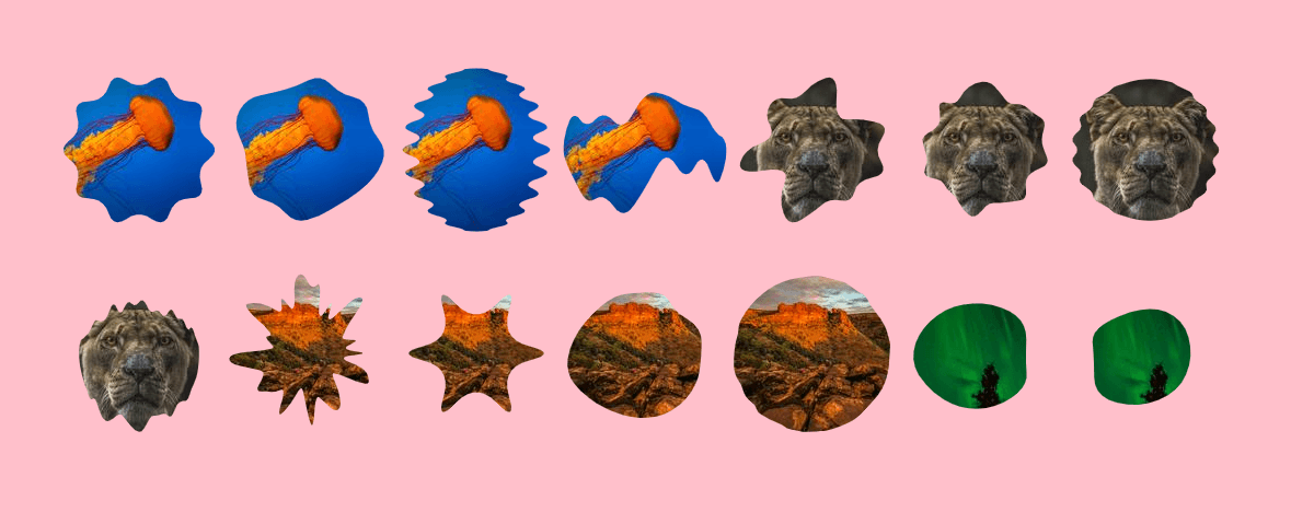
After Part 1 and Part 2, I am back with a third article to explore more fancy shapes. Like the previous articles, we are going to combine CSS Grid with clipping and masking to create fancy layouts for image galleries.
]]>
We’ve spent the last two articles in this three-part series playing with gradients to make really neat image decorations using nothing but the element. In this third and final piece, we are going to explore more techniques using the CSS outline property.
Welcome to Part 2 of this three-part series! We are still decorating images without any extra elements and pseudo-elements. I hope you already took the time to digest Part 1 because we will continue working with a lot of gradients to create awesome visual effects.
]]>
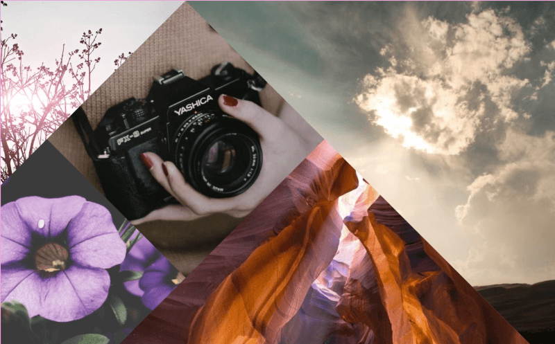
As the title says, we are going to decorate images! There’s a bunch of other articles out there that talk about this, but what we’re covering here is quite a bit different because it’s more of a challenge. The challenge? Decorate an image using only the tag and nothing more.
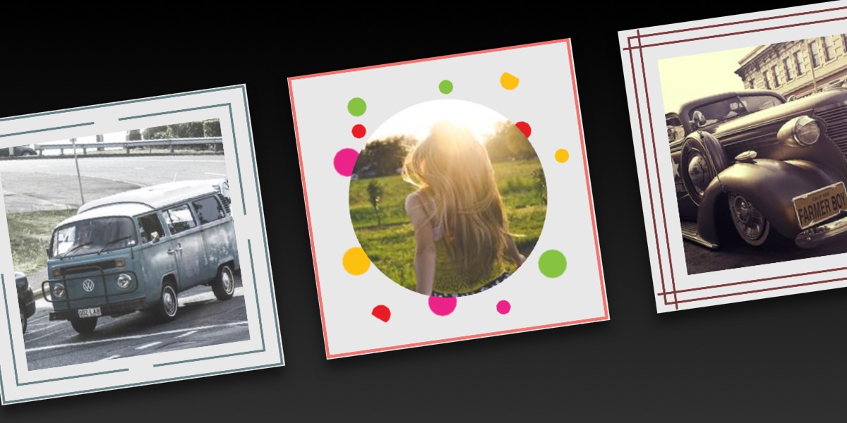
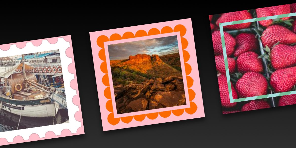
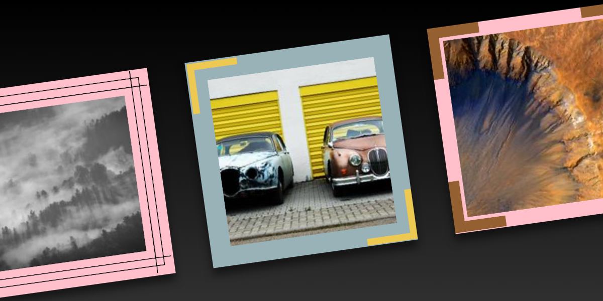
You must have seen those sliders of images that have an infinite loop animation. They are also called infinite carousels where all the images appear and disappear indefinitely. To create such sliders, most of the tricks rely on JavaScript or on duplicating the images. In this post, we will see how to do this without JavaScript and without duplicating any of the images.
]]>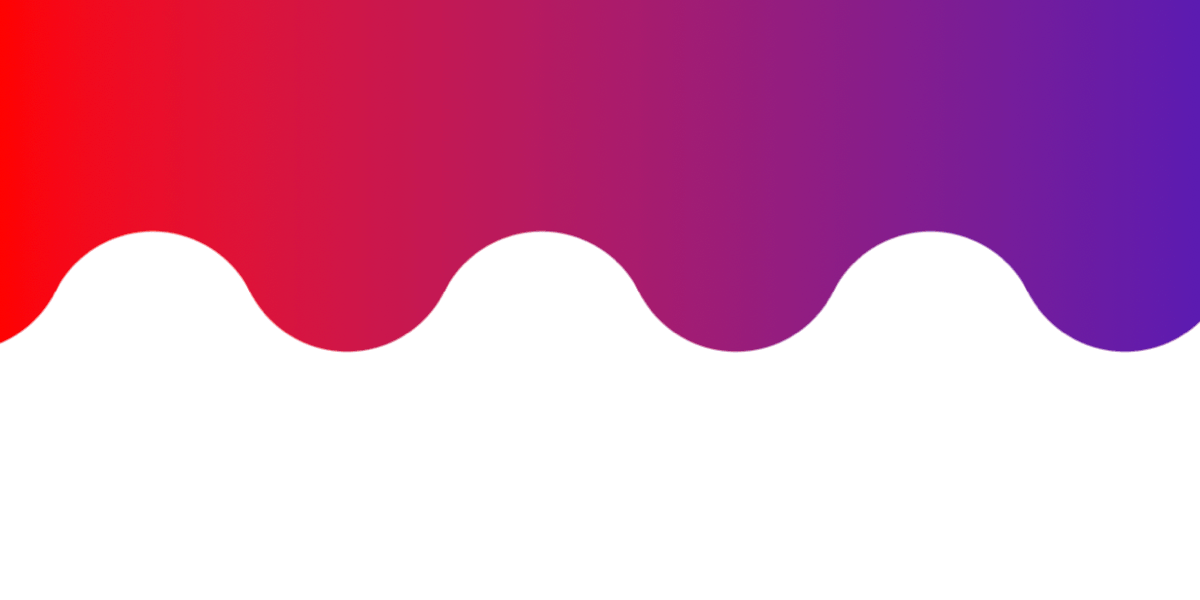
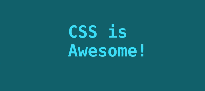
The wave is probably one of the most difficult shapes to make in CSS. We always try to approximate it with properties like border-radius and lots of magic numbers until we get something that feels kinda close. And that’s before we even get into wavy patterns, which are more difficult.
]]>
I recently discovered the joy of creating CSS-only games. It’s always fascinating how HTML and CSS are capable of handling the logic of an entire online game, so I had to try it!
]]>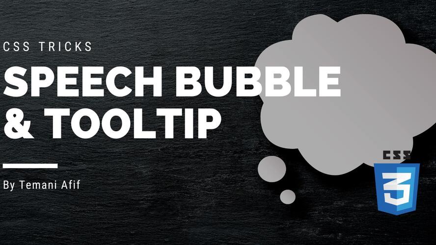
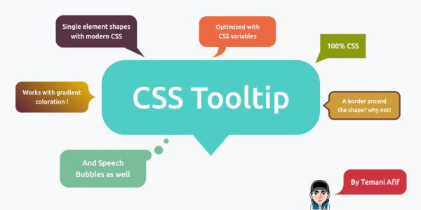
In this article, we will study two common web components: Tooltip and Speech Bubble. Both have different names but share the same design idea. We always have that small arrow/tail linked to a rectangular element with or without rounded corners.
]]>
Ready for the second round? We are still working with CSS Grid, clip-path, and mask, but by the end of this article, we’ll end up with different ways to arrange images on the grid, including some rad hover effects that make for an authentic, interactive experience to view pictures.
]]>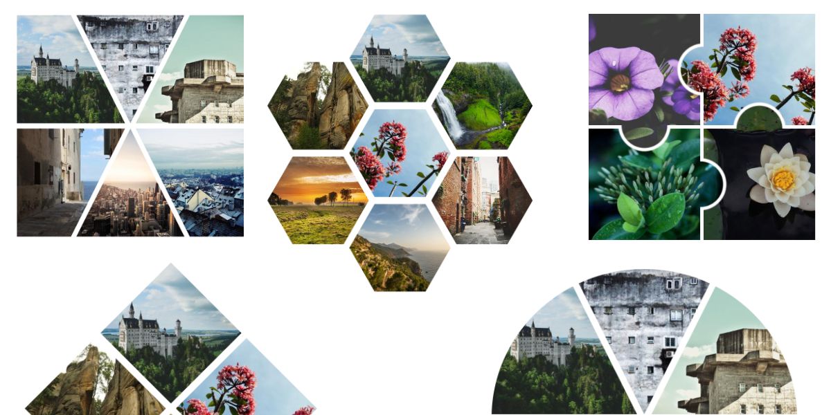
In a previous article, I looked at CSS Grid’s ability to create complex layouts using its auto-placement powers. I took that one step further in another article that added a zooming hover effect to images in a grid layout. This time, I want to dive into another type of grid, one that works with shapes.
]]>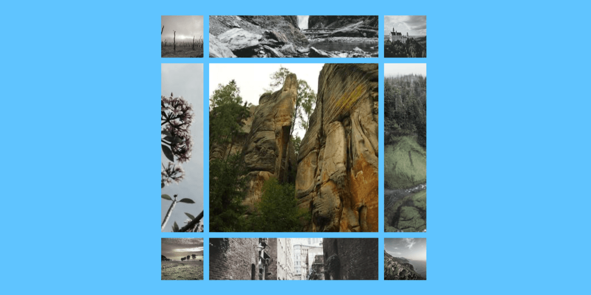
Creating a grid of images is easy, thanks to CSS Grid. But making the grid do fancy things after the images have been placed can be tricky to pull off. Say you want to add some fancy hover effect to the images where they grow and zoom beyond the rows and columns where they sit? We can do that!
]]>
A loader is an important component of a website. It can be used in many places where we need to show that something is in progress. Such a component needs to be as simple as possible and in this post, we will learn how to create different CSS-only loaders with an optimized code.
]]> ]]>
]]>
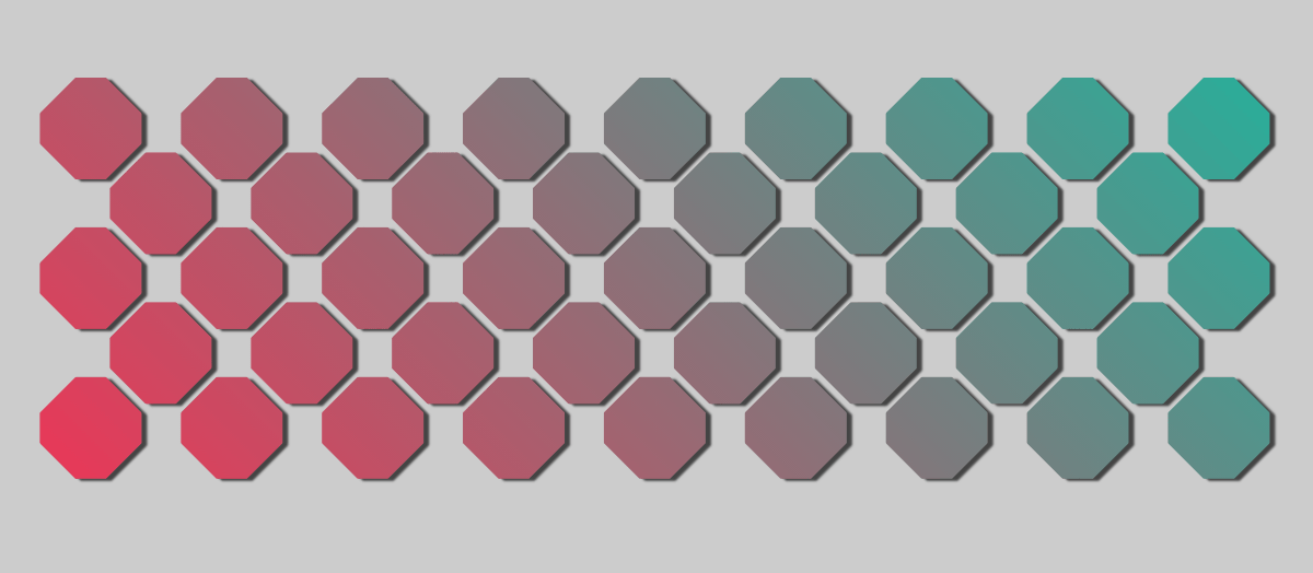
Having a good background pattern can make a difference in your website design. Thanks to CSS gradients, we can create fancy and cool patterns using a few lines of code. In this post, we will study the conic-gradient and use it to create different CSS patterns.
]]>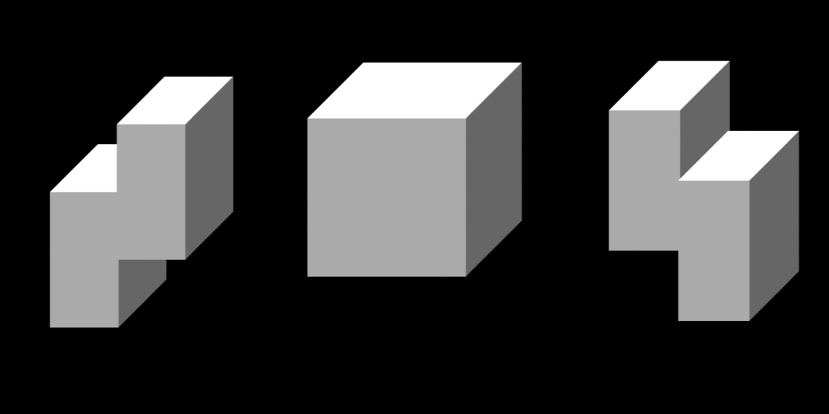
For this fourth and final article of our little series on single-element loaders, we are going to explore 3D patterns. When creating a 3D element, it’s hard to imagine that just one HTML element is enough to simulate something like all six faces of a cube.
]]>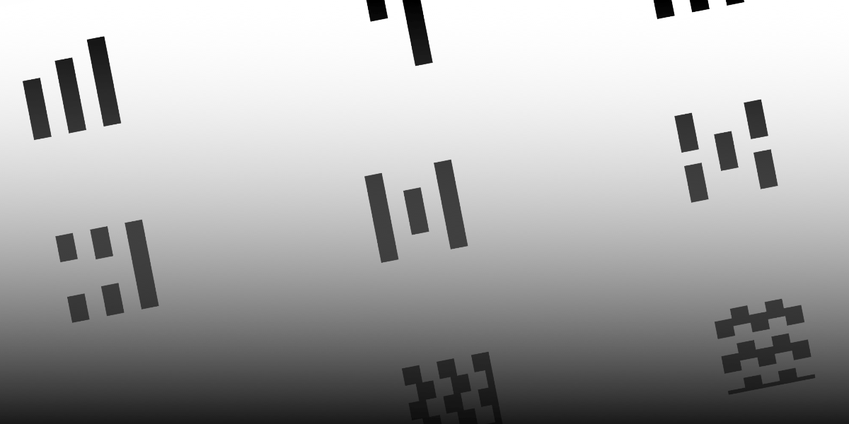
We’ve looked at spinners. We’ve looked at dots. Now we’re going to tackle another common pattern for loaders: bars. And we’re going to do the same thing in this third article of the series as we have the others by making it with only one element and with flexible CSS that makes it easy to create variations.
]]>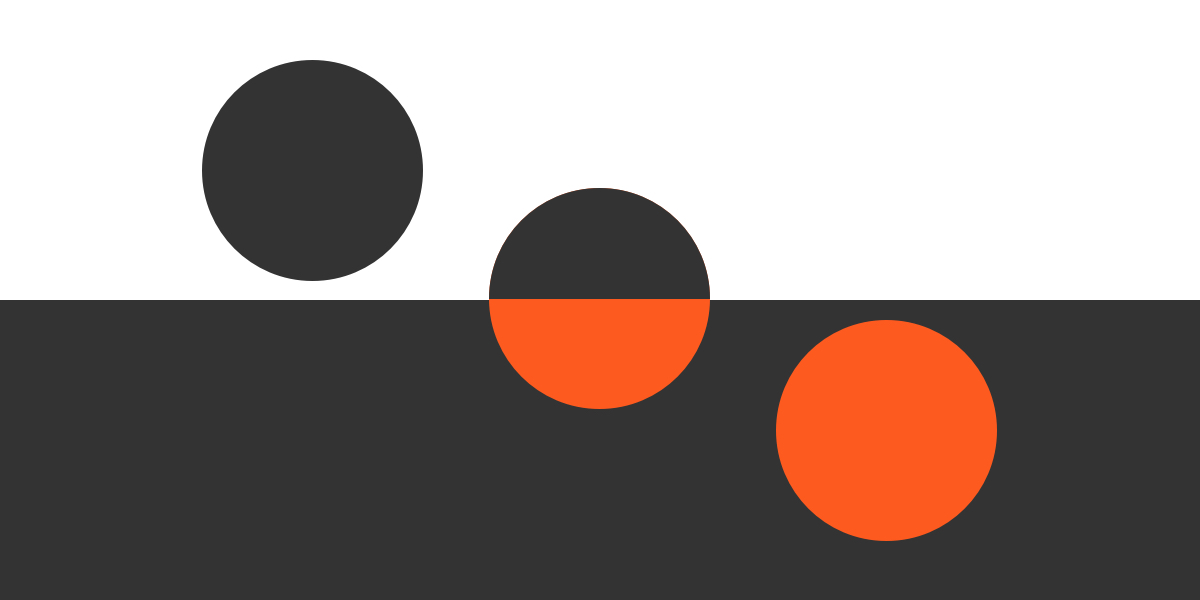
We’re looking at loaders in this series. More than that, we’re breaking down some common loader patterns and how to re-create them with nothing more than a single div. So far, we’ve picked apart the classic spinning loader. Now, let’s look at another one you’re likely well aware of: the dots.
]]>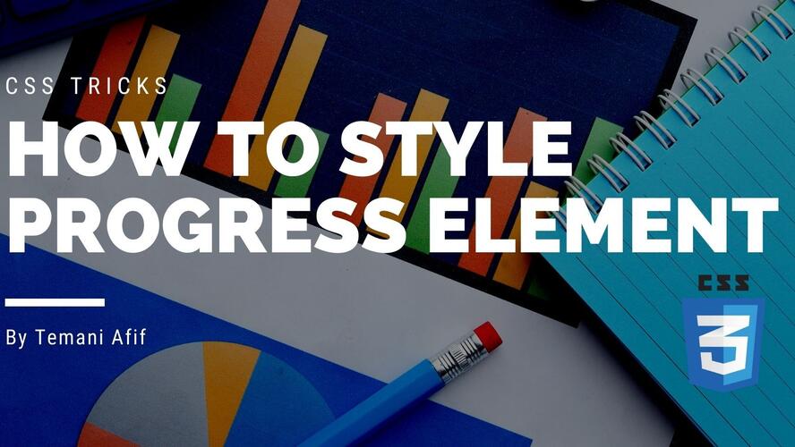
HTML offers a native element to show progression which is progress. In this post, we will learn a few CSS tricks to style such an element. We will also see how to make it look the same across browsers because the native element will, by default, render differently based on the browser.
]]>
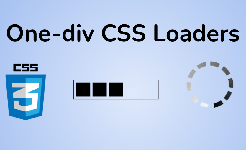
Making CSS-only loaders is one of my favorite tasks. It’s always satisfying to look at those infinite animations. And, of course, there are lots of techniques and approaches to make them. In this article, though, we will see how to make a single element loader writing as little code as possible.
]]>
In this article, we’re talking about background clipping, CSS masks, and even getting our feet wet with 3D perspectives. In other words, we are going to explore advanced techniques this time around and push the limits of what CSS can do with hover effects!
]]>
In my last article we saw how CSS background properties allow us to create cool hover effects. This time, we will focus on the CSS text-shadow property to explore even more interesting hovers.
]]>
The hamburger menu is a must when dealing with responsive design. Having the ability to show/hide the menu on small screens is essential to keep the navigation on the website easy. In this post, we will build a CSS-only responsive menu with a minimalist code.
]]> ]]>
]]>
If you are new to CSS gradients, you may have heard about something called radial-gradient(). If you have never used it before, you are in the right place to learn about it.
]]>
In this post, we will study CSS techniques that allow us to update the style of such elements without extra HTML code. Yes, we are going to give a fresh look to our input elements using only CSS!
]]>
A lot of tricks exist to style images but in this post, we will see how to style them without a ton of code, using CSS effects. We will consider only the element and a few lines of CSS code. No extra elements and No pseudo element!
We recently covered creating fancy borders with CSS mask properties, and now we are going to cut the corners with CSS mask and clip-path! A lot of techniques exist to cut different shapes from the corners of any element. In this article, we will consider modern techniques to create unique corner shapes while trying to work from reusable code that allows us to produce different results by adjusting variables.
]]>
We will explore different section dividers made using only CSS and some optimized code that's easy to manipulate.
]]>
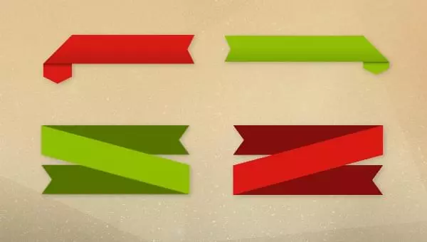
In this post, I will show you how to create two types of ribbons with some simple CSS code where you don't need to bother yourself with tweaking a lot of values
]]>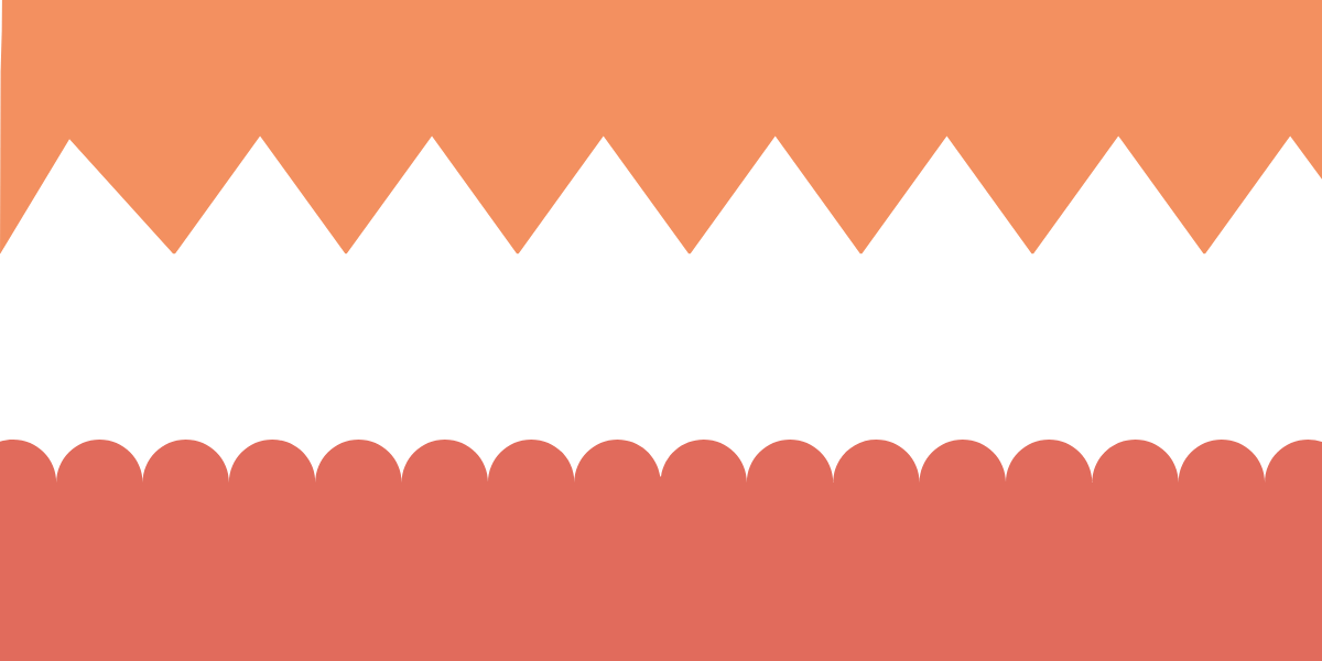
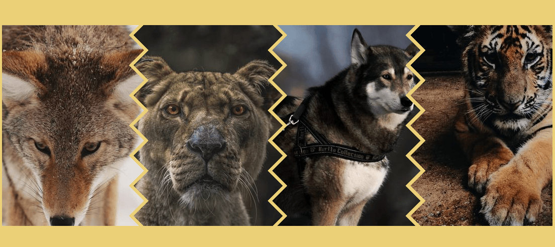
Have you ever tried to make CSS borders in a repeating zig-zag pattern? Like where a colored section of a website ends and another differently colored section begins — not with a straight line, but angled zig zags, rounded humps, or waves.
]]>
In this post, we will see how to build two types of loaders with only one element and a few lines of CSS code. Not only this but we will make them customizable so you can easily create different variations from the same code
]]>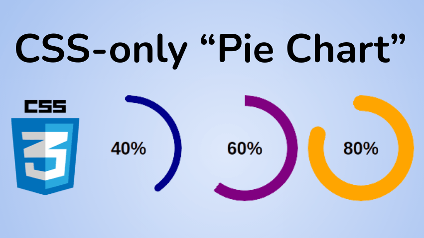
In this post, I will show you how to create a pie chart using CSS and only one element.
]]>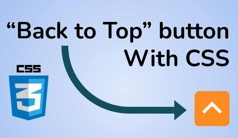
Most websites rely on JavaScript to toggle the visibility of the button based on the amount of scroll. In this post, I will show you how to create such an effect using only CSS.
]]>
Since the introduction of media queries (literally decades ago), CSS has evolved to the points that there are a lot of tricks that can help us drastically reduce the usage of media queries we use. In some cases, I will show you how to replace multiple media queries with only one CSS declaration. These approaches can result in less code, be easier to maintain, and be more tied to the content at hand.
]]>
Adding borders to complex shapes is a pain, but rounding the corner of complex shapes is a nightmare! Luckily, the CSS Paint API is here to the rescue! That’s what we’re going to look at as part of this “Exploring the CSS Paint API” series.
]]>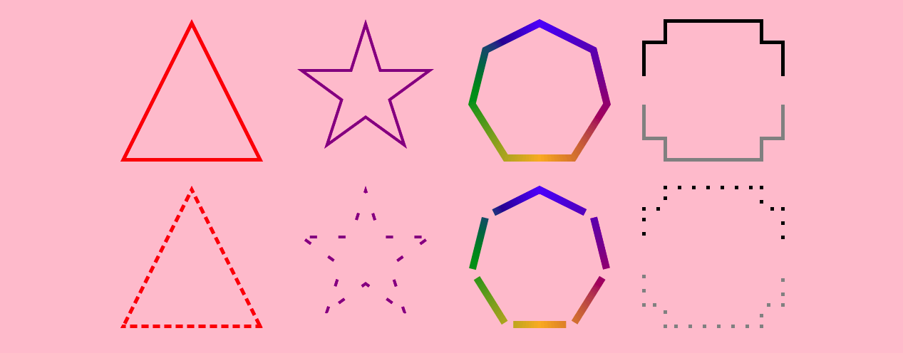
Nowadays, creating complex shapes is an easy task using clip-path, but adding a border to the shapes is always a pain. There is no robust CSS solution and we always need to produce specific “hacky” code for each particular case. In this article, I will show you how to solve this problem using the CSS Paint API.
]]>
Yes, another post about CSS loaders but this time you will build the loader! In this article, I will share with you a few tricks I used to build some of my loaders.
]]> ]]>
]]>
After the fragmentation effect, I am going to tackle another interesting animation: the blob! We all agree that such effect is hard to achieve with CSS, so we generally reach for SVG to make those gooey shapes. But now that the powerful Paint API is available, using CSS is not only possible, but maybe even a preferable approach once browser support comes around.
]]>
You want a Typewriter effect for your text but you are lost within all the variations that use JS and the ones that use a complex CSS code. Search no more! Here is a simple typewriter effect with only a few lines of CSS where you don't need to deal with any complex code. It's scalable and works with any kind of text.
]]>
In my previous article, I created a fragmentation effect using CSS mask and custom properties. It was a neat effect but it has one drawback: it uses a lot of CSS code (generated using Sass). This time I am going to redo the same effect but rely on the new Paint API.
]]>
Like star rating, reaction components are something widely used in many websites so here I am with my own implementation: A CSS-only reaction component that works with emojis or any kind of custom icons.
]]>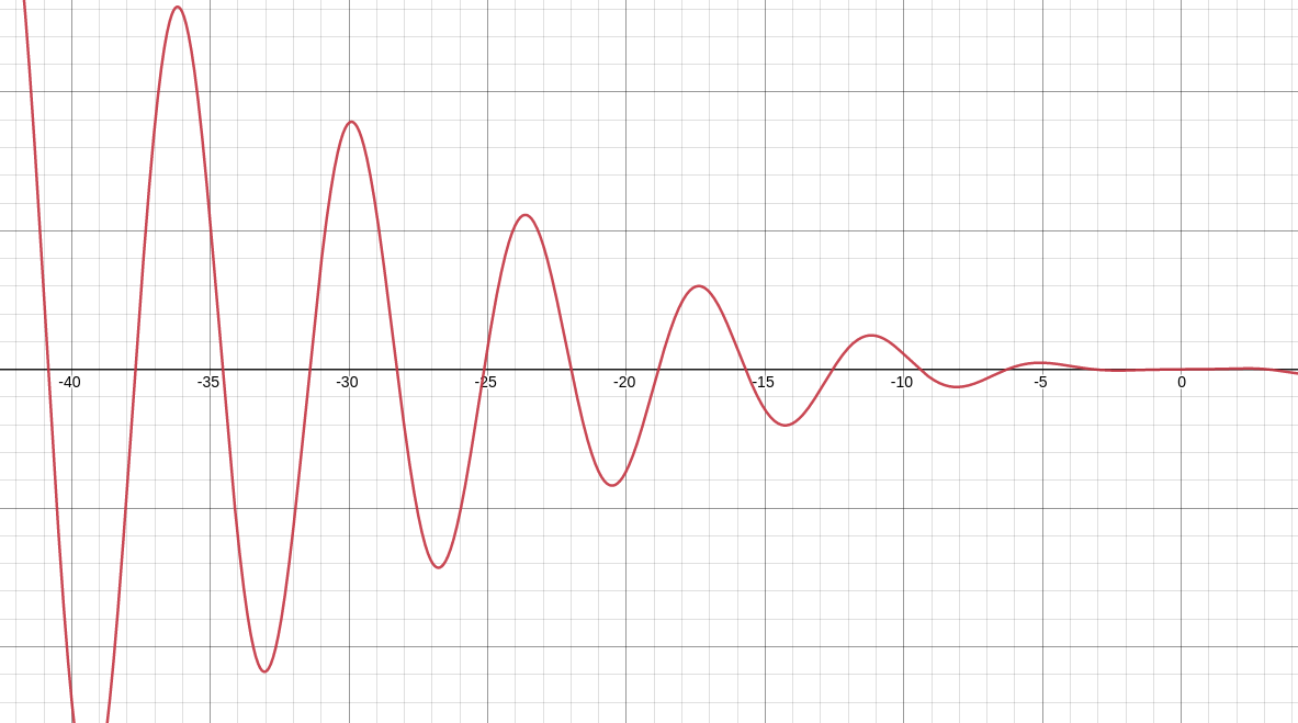
I recently illustrated how we can achieve complex CSS animations using cubic-bezier() and how to do the same when it comes to CSS transitions. I was able to create complex hover effect without resorting to keyframes. In this article, I will show you how to create even more complex CSS transitions.
]]>
I’m here to resurrect our old friend float to create the same sort of complex and responsive layout but with less complexity and without a single media query.
]]>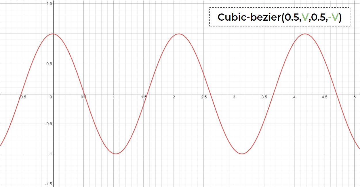
There’s one especially neat timing function that gives us total control to create custom timing functions. That would be cubic-bezier() and in this post I will show you the power of it and how it can be used to create fancy animation without too much complexity.
]]>
Need to lay out an element to the right or the left, such that text wraps around it? That’s an easy task for the float property. But what about if you also want to push that element (let’s call it an image) to one of the bottom corners while we’re at it? Sounds a bit tricky, right? We probably need JavaScript? Nope, few lines of (tricky) CSS can do it!
]]>
CSS Variables are great but do you know everything about them? In this post, I will highlight a few quirks around CSS variables that no one talks about. After that, you won't look at them the same way anymore.
]]>
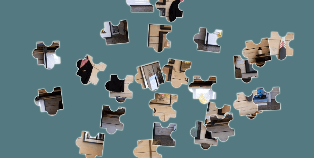
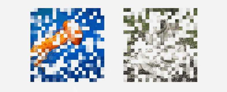
I have a similar idea, but with a different approach. Instead of revealing the image, let’s start with it fully revealed, then let it disappear one tile at a time, as if it’s floating away in tiny fragments.
]]> ]]>
]]>
It's always a hassle to correctly position a rotated text. Especially to position such text in the corner or the sides of another element.
]]>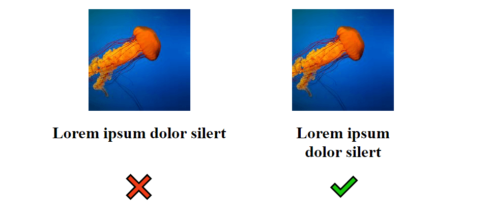
We all face such a requirement where we need to make a title below (or above) an image to not exceed the width of the image. In most of the cases, we need them to have the same width.
]]>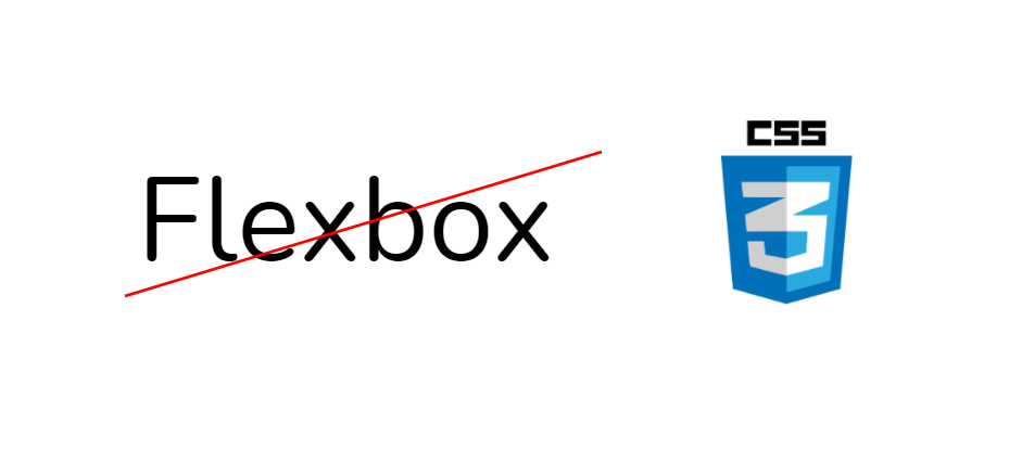
Flexbox is great. Unfortunately, many developers use it in the wrong way. To be more precise, they use it automatically everywhere even when it should not be used.
]]> ]]>
]]>